In the previous episode, I made the introduction to using scopes in Hanami 2 applications. Today I will dig a bit further, and leverage the Parts feature, so if you're not familiar with this, I'd recommend visiting the guides first or checking out my previous episodes on these topics.
Today I want to eliminate all the logic in complex templates in Hanami 2, step-by-step.
Let's begin.
Overview of the problem
I have here the registration form created for rendering the flash messages tutorial, however, it's not fully functional yet.
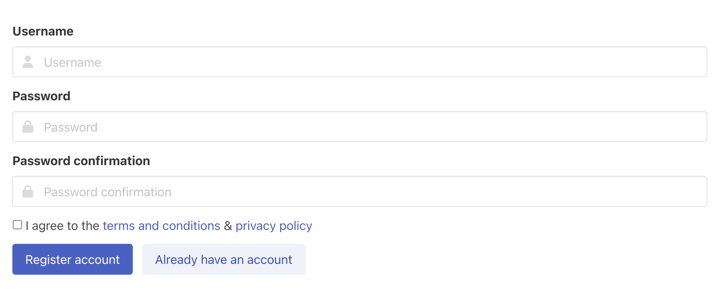 Basic form error with no errors
It contains a couple of fields only, but you may already see that it's a pretty bloated piece of HTML, that is supposed to mix quite a bunch of rendering logic in.
<%= form_for :registration, routes.path(:register_account) do |f| %>
  <div class="field">
    <%= f.label "username", class: "label" %>
    <div class="control has-icons-left">
      <%= f.text_field :username, class: "input" %>
      <span class="icon is-small is-left">
        <i class="fas fa-user"></i>
      </span>
    </div>
  </div>

  <div class="field">
    <%= f.label "password", class: "label" %>
    <div class="control has-icons-left">
      <%= f.password_field :password, class: "input" %>
      <span class="icon is-small is-left">
        <i class="fas fa-lock"></i>
      </span>
    </div>
  </div>

  <div class="field">
    <%= f.label "password_confirmation", class: "label" %>
    <div class="control has-icons-left">
      <%= f.password_field :password_confirmation, class: "input" %>
      <span class="icon is-small is-left">
        <i class="fas fa-lock"></i>
      </span>
    </div>
  </div>

  <div class="field">
    <div class="control">
      <label class="checkbox">
        <input type="checkbox">
        I agree to the <a href="#">terms and conditions</a>
      </label>
    </div>
  </div>

  <div class="field is-grouped">
    <div class="control">
      <button class="button is-link">Submit</button>
    </div>
    <div class="control">
      <button class="button is-link is-light">Cancel</button>
    </div>
  </div>
<% end %>
For example, if there are errors in a particular field, the input should be highlighted with a red border, and the exclamation icon should be added to the right side of the input.
Additionally, below the input, there should be the exact red notification about what's wrong with this field.
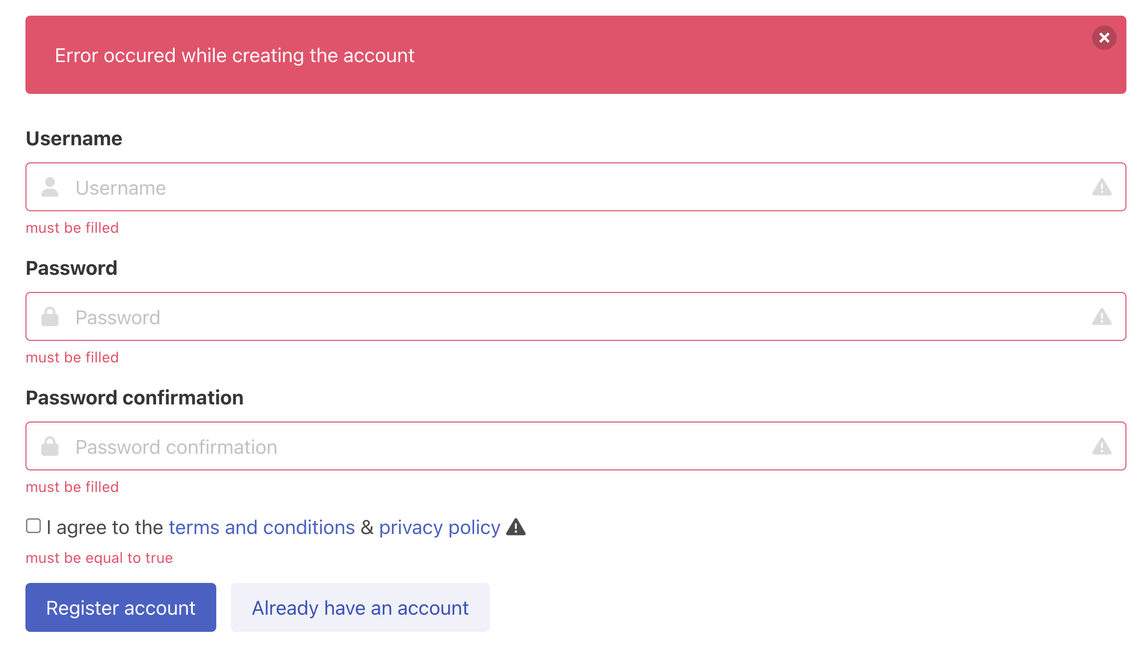 Registration form with error messages
Today I want to do the challenge to extract this logic and refactor the code, so it's easier to work with the dynamic data we have here.
Render the field input error messages
Rendering errors from the action.
Before we do anything, let's make sure we can properly render the field errors. For that purpose, I'm going to visit my create action and add the custom view rendering line there.
By default, the create action will render the new view, with the request parameters being accessible, so the form can preserve the field values we passed in. Except password fields of course, which are filtered out.
However, because we want to add the errors to work with, let me render the view manually.
# slices/main/actions/registrations/create.rb

else
  response.flash.now[:alert] = "Error occured while creating the account"
  response.render(
    view,
    values: request.params[:registration],
    errors: request.params.errors[:registration]
  )
end
Expose the form object in the view
Now in the view, I can make use of this to expose the form object I would like to work with in the templates. I'll make it dependent on the values and errors input arguments, but will set defaults for them, so the new action can render the view without passing any parameters to it.
Then inside, I'll return the hash that merges those two together and will decorate this value in a moment.
By default, to decorate this, the Parts::Form class would be used, but because this is the only form in my app right now, and the common patterns haven't emerged yet, I'll make this more explicit, and paste the custom part class in the options.
# slices/main/views/registrations/new

module Main
  module Views
    module Registrations
      class New < Main::View
        expose(:form, as: Parts::Forms::Registration) do |values: {}, errors: {}|
          {
            values: values,
            errors: errors
          }
        end
      end
    end
  end
end
Building a registration form part
Now let's build this part. I'm going to create a new part file, and inside add the errors method, that allows me to list the error messages for a particular input field, so I'll be able to list those below the form's entry.
# slices/main/views/parts/forms/registration.rb

module Main
  module Views
    module Parts
      module Forms
        class Registration < Part
          def errors(key)
            value.dig(:errors, key).to_a
          end
        end
      end
    end
  end
end
Rendering input field error messages
That's enough for now. Let's use it in the template now.
Under each field, I'm going to paste the line that will render the field error messages, and paste that messages as a local. Then I only want to render errors if there is actually an error message.
<div class="field">
  <%= f.label "username", class: "label" %>
  <div class="control has-icons-left">
    <%= f.text_field :username, class: "input" %>
    <span class="icon is-small is-left">
      <i class="fas fa-user"></i>
    </span>
    <%= render("shared/forms/field_errors", messages: forms.error(:username)) if form.errors(:username).any? %>
  </div>
</div>
I also need to add dynamic class names for the form if the field errors out
<div class="control has-icons-left <%= 'has-icons-right is-danger' if form.errors[:username].any? %>">
Disclaimer
By the way, I know there is a logic here, I am doing things step by step so you won't get lost in my thinking process.
When I copy these field implementations over, you'll see that the only thing that changes here is the field name, and that's already a pattern for me.
Then I will add the _field_errors partial. First I am going to render the exclamation triangle icon span, and then for each of the provided messages, I'll add the properly styled paragraph one under the other.
# slices/main/templates/shared/forms/_field_errors.html.erb

<span class="icon is-small is-right">
  <i class="fas fa-exclamation-triangle"></i>
</span>

<% messages.each do |msg| %>
  <p class="help is-danger"><%= msg %></p>
<% end %>
The form now should render errors for each field. Voila! That's the basic level. Now let's go to the level 2.
Form input field logic extraction
All those fields are very similar. The HTML part is different, but the logic inside is just the same. All they need is
- a form object to render the field values correctly
- information if the error is there,
- error messages,
- icon name
- attribute name
- and maybe custom label text as you may see in the case of the checkbox here.
Step 1. Normalize your partials
Let me then extract the fields to separate field-based templates. I'm going to create a separate template for each field type in the shared/forms directory and paste the code inside, simplifying the logic a bit.
First I want to create the text_field template. I want to remove the username and replace it with the general field_name local. Then I want to be able to pass down a custom label text if needed.
# slices/main/templates/shared/forms/_text_field.html.erb

<%-
field_name = 'username'
label_text = 'Username'
%>
<div class="field">
  <%= (f.label field_name, class: "label") { label_text } %>
  <div class="control has-icons-left">
    <%= f.text_field field_name, class: "input" %>
    <span class="icon is-small is-left">
      <i class="fas fa-user"></i>
    </span>
    <%= render("shared/forms/field_errors", messages: forms.error[:username]) if form.errors[:username].any? %>
  </div>
</div>
The icon here should also not be hardcoded, but rather set dynamically.
# slices/main/templates/shared/forms/_form_icon.html.erb
<%- icon_name = 'user' %>

<span class="icon is-small is-left">
  <i class="fas fa-<%= icon_name %>"></i>
</span>
Now let's look at error checks. There are two places that check if the field is an error, so let's extract this out too. It comes with setting up dynamic set of classes for the control field that can be extracted to a variable together.
<%
error_field? = form.errors[:username].any?
control_class_names = ''
control_class_names << 'has-icons-right' if error_field?
%>
<div class="field">
  <%= (f.label field_name, class: "label") { label_text } %>
  <div class="control has-icons-left <%= control_class_names %>">
    <%= f.text_field field_name, class: "input" %>
    <span class="icon is-small is-left">
      <i class="fas fa-user"></i>
    </span>
    <%= render("shared/forms/field_errors", messages: forms.error[:username]) if errors_field? %>
  </div>
</div>
Next, let's tackle the error messages, to not be dependent on the field name at all.
<%- errors = forms.error[:username] %>
<div class="field">
  <%= (f.label field_name, class: "label") { label_text } %>
  <div class="control has-icons-left <%= control_class_names %>">
    <%= f.text_field field_name, class: "input" %>
    <span class="icon is-small is-left">
      <i class="fas fa-user"></i>
    </span>
    <%= render("shared/forms/field_errors", messages: errors if errors_field? %>
  </div>
</div>
You may notice here, that the if statement is left here to render the errors partial, and I don't know how about you, but for me, it's logic in a template for sure! However, I've already shown the other approach to render field-specific errors in forms in [[46-contact-form|episode 46]], so you may as well check that out, and here I'll just leave it like this.
Finally, let's take a closer look at the class names. There are custom classes added, if there is an error, but also, if the icon is set. Without the icon, we don't need the has-icons-left class, which makes this list of classes even more complex. Let's extract this out too.
<%
has_icon? = !icon_name.nil?
control_class_names = ''
control_class_names << 'has-icons-left' if has_icon?
control_class_names << 'has-icons-right' if error_field?
%>
<div class="field">
  <%= (f.label field_name, class: "label") { label_text } %>
  <div class="control has-icons-left <%= control_class_names %>">
    <%= f.text_field field_name, class: "input" %>
    <span class="icon is-small is-left">
      <i class="fas fa-user"></i>
    </span>
    <%= render("shared/forms/field_errors", messages: errors) if errors_field? %>
  </div>
</div>
The span class should also be conditional based on the fact that the icon is present. Already we've discovered a bug in our code that can be fixed in a moment! Isn't that cool?
Let me then extract the icon span into a separate partial. Let's render the icon passing down the name as a local, and the aligment information. Then do nothing if the icon should not be set.
I'll create a new partial, named field_icon, and inside I'll paste my span, replacing dynamic content with local variables. The icon_name local I'll rename to icon, and replace that when rendering too.
# slices/main/templates/shared/forms/field_icon.rb

<span class="icon is-small is-<%= align %>">
  <i class="fas fa-<%= icon %>"></i>
</span>
I can replace that when rendering the partial too!
has_icon? = !icon_name.nil?
<div class="field">
  <%= (f.label field_name, class: "label") { label_text } %>
  <div class="control has-icons-left <%= 'has-icons-right' if error_field? %>">
    <%= f.text_field field_name, class: "input" %>
    <%= render("shared/forms/field_icon", icon: 'user', align: 'left') %>
    <%= render("shared/forms/field_errors", messages: errors if errors_field? %>
  </div>
</div>
I can even go to the field_errors template now and also change the hardcoded span tag to just render the icon partial.
# slices/main/templates/shared/forms/_field_errors.html.erb
<%= render("shared/forms/_field_icon", icon_name: 'exclamation-triangle', align: 'right') %>

<% messages.each do |msg| %>
  <p class="help is-danger"><%= msg %></p>
<% end %>
Oh! I see I've named the icon partial wrongly. Let me quickly rename the file to field_icon, and reflect that in partials that call it. Now it's fine.
Finally, let's take a closer look at the input field. I want to have the extra class added in case of an error, so it gets the ==red highlight==. I will extract it the same way as I did for a wrapper div.
input_field_classes = "input #{ 'is-danger' if error_field? }"
When I think about it, I can even add a dynamic placeholder support. Let's also allow this to be passed in.
Pheeew, done. That's crazy! I hope you can see now, how much logic is hidden in templates of most applications, and with this knowledge, we can together make the world a better place!
<%
field_name = 'username'
label_text = 'Username'
icon_name = 'user'
has_icon? = !icon_name.nil?
error_field? = form.errors[:username].any?
errors = forms.error[:username]
control_class_names = ''
control_class_names << ' has-icons-left' if has_icon?
control_class_names << ' has-icons-right is-danger' if error_field?
placeholder_text = ''
input_field_classes = "input #{ 'is-danger' if error_field? }"
%>
<div class="field">
  <%= f.label(field_name, class: "label") { label_text } %>
  <div class="control <%= control_class_names %>">
    <%= f.text_field(field_name, class: input_field_classes, placeholder: placeholder_text) %>
    <%= render('field_icon', icon: icon_name) if has_icon? %>

    <%= render("field_errors", messages: errors) if error_field? %>
  </div>
</div>
I know this is a lot, but by extracting this we can copy the partial and easily adjust it to a password field, email field, or anything else. I will quickly write down the checkbox field here yet, to verify if I need any other dynamic data.
<div class="field">
  <div class="control">
    <%= f.check_box field_name, checked_value: "true", unchecked_value: "false" %>
    <%= f.label class: "checkbox" do %>
      <%= label_text %>
    <% end %>

    <%= render("field_errors", messages: errors) if error_field? %>
  </div>
</div>
No, it seems I need even fewer methods.
Cool! So the next step for me is to write the form input scope, that will accept different inputs and resolve the local variables in a way understandable for an input field partial.
Step 2. Prepare the Form Input Scope
In the new scope file, I am going to paste down all the logic I have extracted from my partial and then wrap them up with the nice ruby methods.
field_name will just call super, and stringify the value, so we can pass in symbols as well.
label_text should be optional, so if there is no label attribute passed in, we'll return the humanized field_name.
let's skip the icon_name for now...
to decide whether the field is error, we need to check errors array, and we already ensure this will be an array, so let's write this down.
Next we have control_class_names. First I need to have the default value, add the icon class if error has icon, and error, if it has an error. At the end we join the classes into a single string. This means, that in the test_field partial I can remove the first part of the control classes and just rely on the variable.
# frozen_string_literal: true

module Main
  module Views
    module Scopes
      module Forms
        class Input < Main::Views::Scope
          def field_name
            super.to_s
          end

          def label_text
            return label if respond_to?(:label) && label

            _context.inflector.humanize(field_name)
          end

          def control_field_classes
            classes = %w[control has-icons-left]
            classes << 'has-icons-right' if error_field?
            classes.join(' ')
          end

          def placeholder_text
            return placeholder if respond_to?(:placeholder) && placeholder

            _context.inflector.humanize(field_name)
          end

          def input_field_classes
            classes = %w[input]
            classes << "is-danger" if error_field?
            classes.join(' ')
          end

          def error_field?
            errors.any?
          end
        end
      end
    end
  end
end
Going back to the scope, errors will be just passed as arguments, so we don't need it. After that I imlpement the input_field_classes method similar to what we have in the control tag, and for the placeholder, I'll again, return the passed in argument, or fallback to default calculated on the field name.
Ok. We have now an amazing class, that we can unit test and that can guarantee that our partials will be rendered correctly. There is a big caveat here though.
If I go to the form template, replace my inputs by calling the input scope with some attributes, and then render the exact template, it does not look much better, does it?
scope(Forms::Input).render(
  field_name: 'username',
  errors: form.errors,
  placeholder: 'Username',
  label: 'Username'
)
It's because this code does not belong to a template. Hanami provides us with parts, as a way to decorate our exposures, and all the data we need to set this up we have on the form exposure, except the form builder.
I could replace this all with
<% form.username_scope(f).
  render("shared/forms/text_field")
%>
Or instead of returning the scope from the part I can even hide the rendering inside the part's method. I will go with the latter approach, though I a not sure which one is better yet, as those concepts are just too new. Looking for your feedback on this!
<% form.username_input(f) %>
Now let me create the missing methods in my part.
Step 3. Final sprint - Setting up the Part
In my registration form part I want to have a method for each input field, that accepts the form builder.
Then each method will render the correct field type, with a separate scope prepared. Again, the actual rendering may belong to a template, but I guess it's just a preference. As long as we're consistent, we should be fine.
The field name here will be a username, the scope will be always the same so I'll extract that to a constant named SCOPE_CLASS.
SCOPE_CLASS = Scopes::Shared::Forms::Input

def username_input(f)
  prepare_scope(f, :username)
    .render("shared/forms/text_field")
end

private

def prepare_scope(f, field_name, **options)
  scope(
    SCOPE_CLASS,
    f: f,
    field_name: field_name,
    errors: errors(field_name),
    **options
  )
end
Then I can repeat that for the remaining scopes form fields, with minimal changes. I need just a field name to be changed, and the partial name to be rendered, and the rest is just the same, except the tac field.
# frozen_string_literal: true

module Main
  module Views
    module Parts
      module Forms
        class Registration < Part
          SCOPE_CLASS = Scopes::Shared::Forms::Input

          def username_input(f)
            prepare_scope(f, :username).
              render("shared/forms/text_field")
          end

          def password_input(f)
            prepare_scope(f, :password).
              render("shared/forms/password_field")
          end

          def password_confirmation_input(f)
            prepare_scope(f, :password_confirmation).
              render("shared/forms/password_field")
          end

          def tac_input(f)
            # TODO: TAC input field
          end

          private

          def prepare_scope(f, field_name, **options)
            scope(
              SCOPE_CLASS,
              f: f,
              field_name: field_name,
              errors: errors(field_name),
              **options
            )
          end

          def errors(key)
            value.dig(:errors, key).to_a
          end
        end
      end
    end
  end
end
Before though, let me clean things up a bit. I'll move the errors to the private section, as this won't be used anymore from the template, then I'm going to setup the correct icon names for the fields.
Now to the tac field rendering. Only this field needs a custom label that I need to prepare, and paste that as an option parameter to the scope.
def tac_input(f)
  tac_link = helpers.link_to "terms and conditions", "#"
  pp_link = helpers.link_to "privacy policy", "#"
  label_text = "I agree to the #{ tac_link } & #{ pp_link }".html_safe
  prepare_scope(f, :tac, label: label_text).
    render("shared/forms/check_box_field")
end
Now that drives us again to the template form where we can replace the complicated HTML with our part methods. This cannot be more clean.
<%= form_for :registration, routes.path(:register_account) do |f| %>
  <%= form.username_input(f) %>
  <%= form.password_input(f) %>
  <%= form.password_confirmation_input(f) %>
  <%= form.tac_input(f) %>

  <div class="field is-grouped">
    <div class="control">
      <%= f.submit "Register account", class: "button is-link" %>
    </div>
    <div class="control">
      <%= link_to "Already have an account", "#", class: "button is-link is-light"%>
    </div>
  </div>
<% end %>
You'll miss the password_field partial yet, but that's identical to the input_field, except the method used on the form builder, so I can prepare that quickly before running the app.
Let me check now what happens in the browser, as I've written quite a bunch of code at once. There is an error saying, that icon_name is called, but it is not passed into the scope in one call. Let me check. Oh, it's because our checkbox has no icon passed, but I still call this method on the conditional. I'll just make it optional. Can be solved in the part, but that's fine for now.
Now the form works flawlessly, as before, but our template is as slim as one can imagine.
Summary
Working with templates is a hard job and eliminating the logic out of them is absolutely not trivial. Hanami provides us with a bunch of tools that help us maintain this complexity and keep our templates always simple and clean. But there are still multiple tradeoffs.
You always need to balance between how simple and skinny your template is, and how easy it is to update by frontend developers, which means, how much ruby code leaks to it.
I hope that this and previous episodes about the topic show you different approaches and that you'll find them useful! If you want to see more content in this fashion, Subscribe to my YT channel, Newsletter and follow me on Twitter!
Thanks
I want to especially thank my recent sponsors,
and all the Hanami Mastery PRO subscirbers, for supporting this project, I really appreciate it!
Consider sponsoring?
If you want to support us, check out our Github sponsors page or join Hanami Mastery PRO as mentioned just before!
Thank you and have a happy rest of your day!
Add your suggestion to our discussion panel!
I'll gladly cover them in the future episodes! Thank you!